 menu menu
 Noah Levin


 Figma @figmadesign🚀 Just announced at #Config2021: FigJam.
FigJam is a new online whiteboard for teams to ideate and brainstorm together.
Check it out: twitter.com
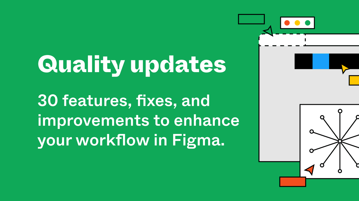
Figma @figmadesign🚀 Just announced at #Config2021: FigJam.
FigJam is a new online whiteboard for teams to ideate and brainstorm together.
Check it out: twitter.com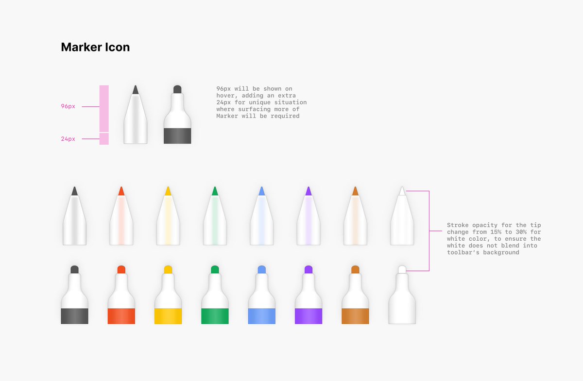

 Niko @nikolaskleinFloored by all the feedback I received after yesterday's talk about Collaborative Creativity! Thank you so much!!!
♥️
Quick recap below. The talk was recorded and will be published in a month and here are all the slides: twitter.com
Niko @nikolaskleinFloored by all the feedback I received after yesterday's talk about Collaborative Creativity! Thank you so much!!!
♥️
Quick recap below. The talk was recorded and will be published in a month and here are all the slides: twitter.com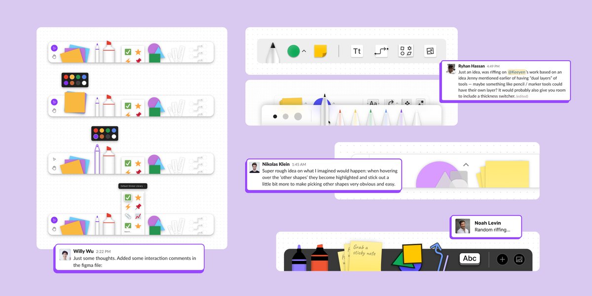
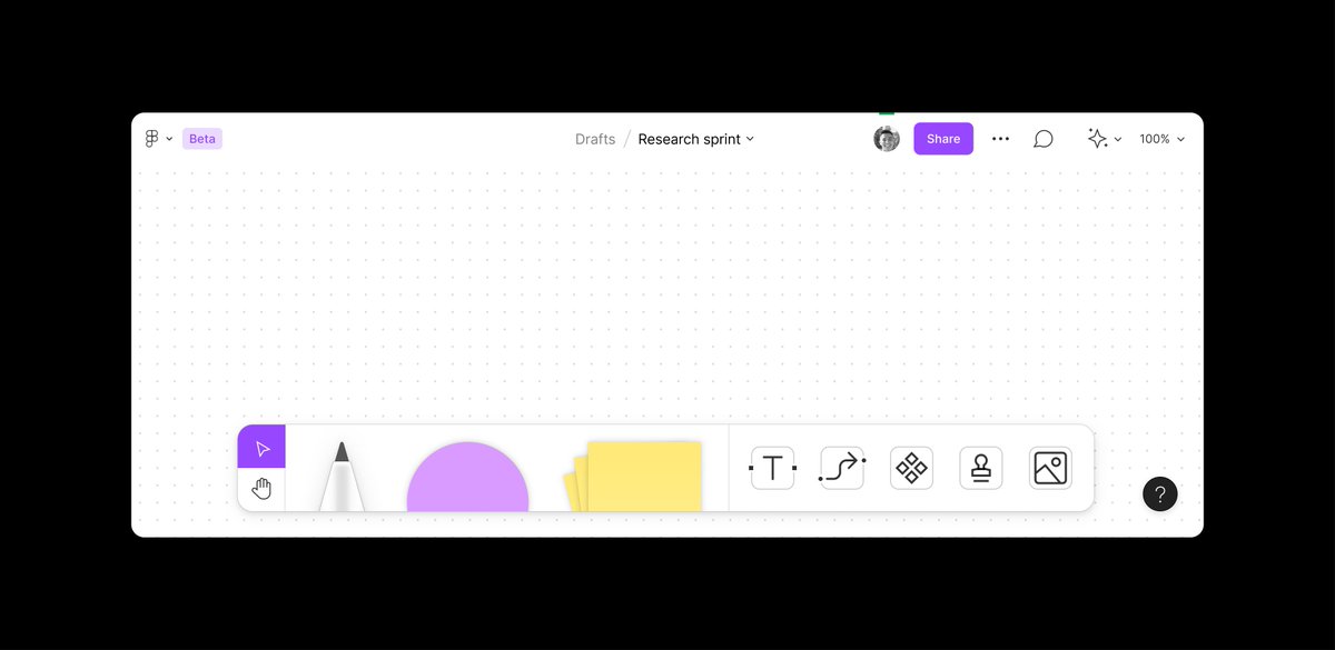
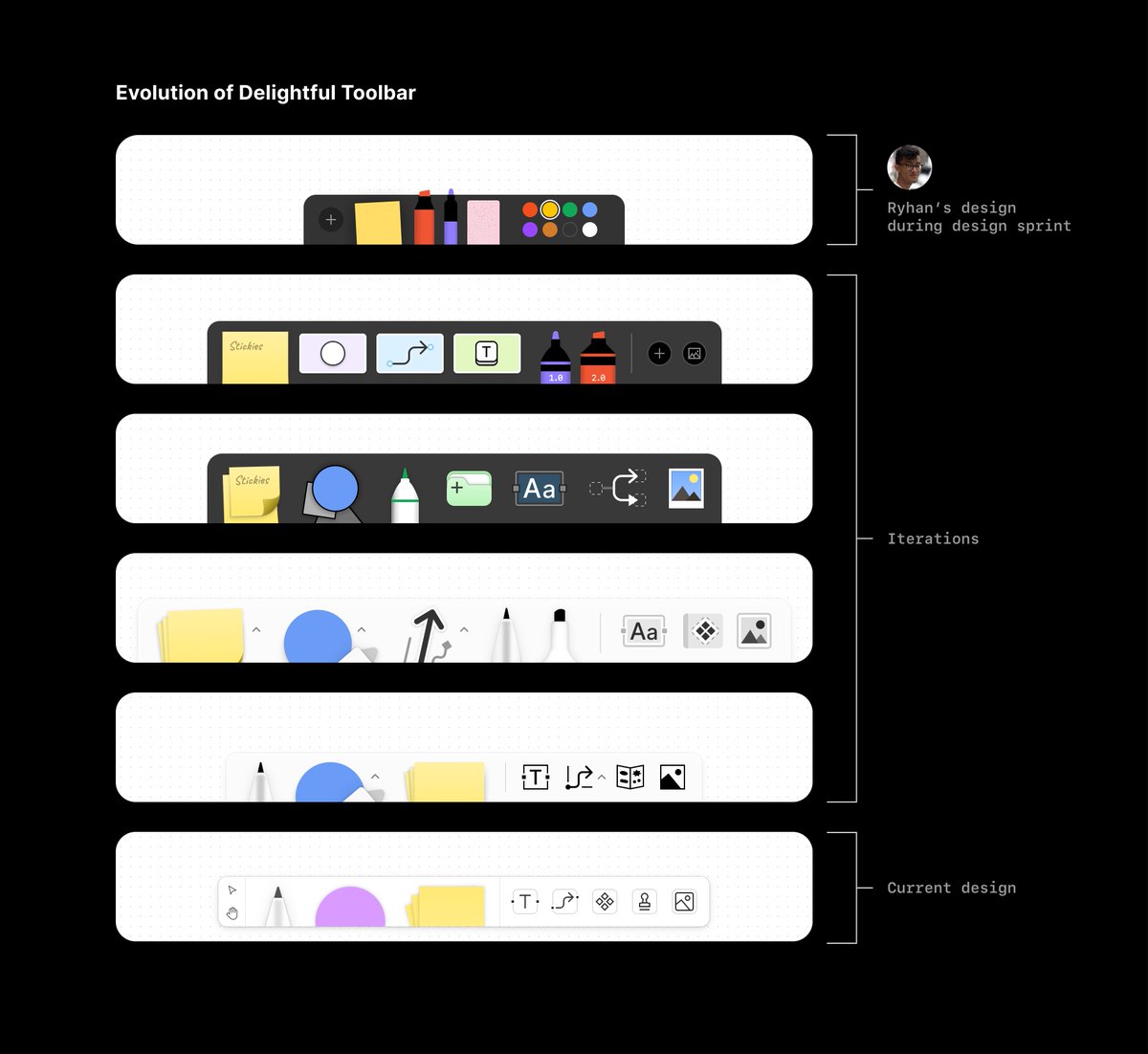
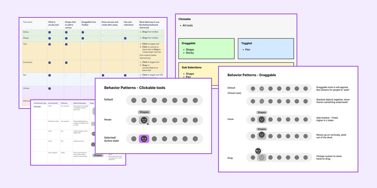
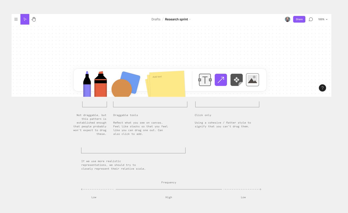
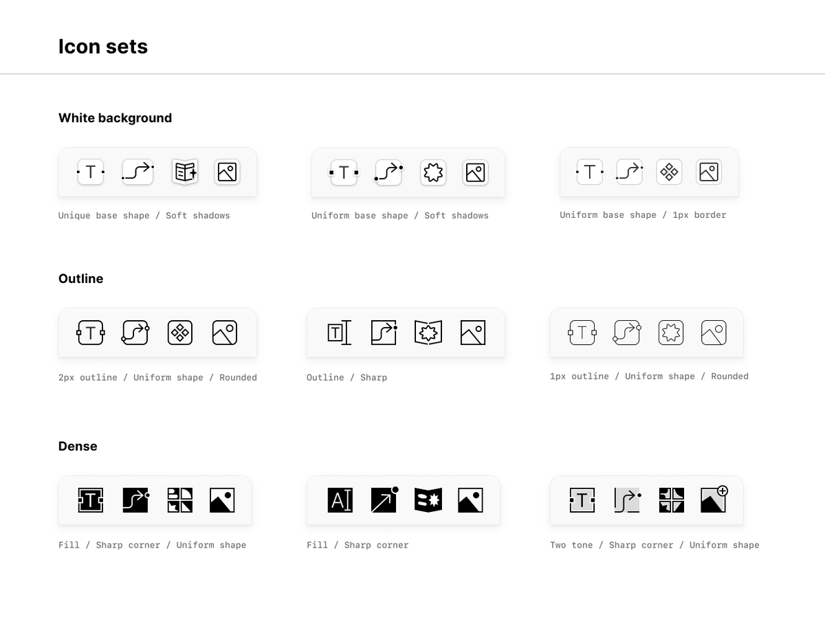
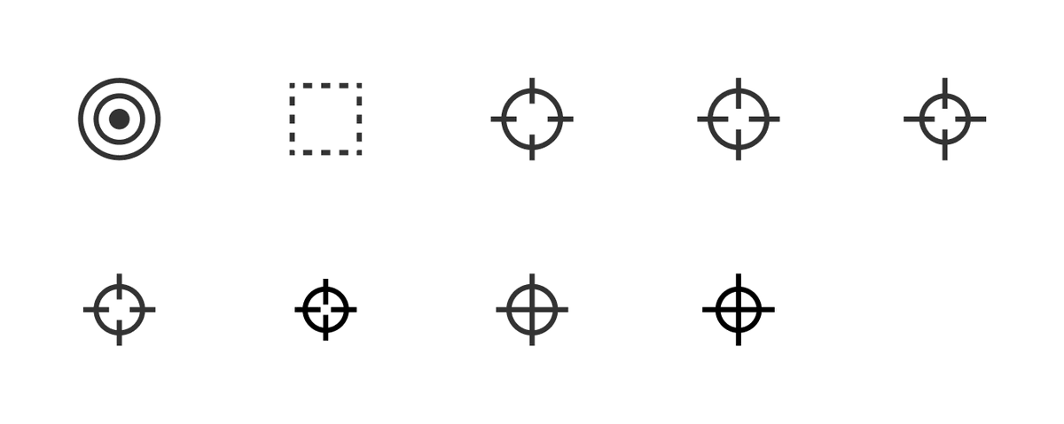
 keeyen @keeyeny🤩 @figmadesign ' s new white boarding tool, FigJam launches today! I’m glad to be able to contribute in this huge team effort by leading the design of the toolbar.
I’ll be updating this thread on some of the process and design details 👇 twitter.com
keeyen @keeyeny🤩 @figmadesign ' s new white boarding tool, FigJam launches today! I’m glad to be able to contribute in this huge team effort by leading the design of the toolbar.
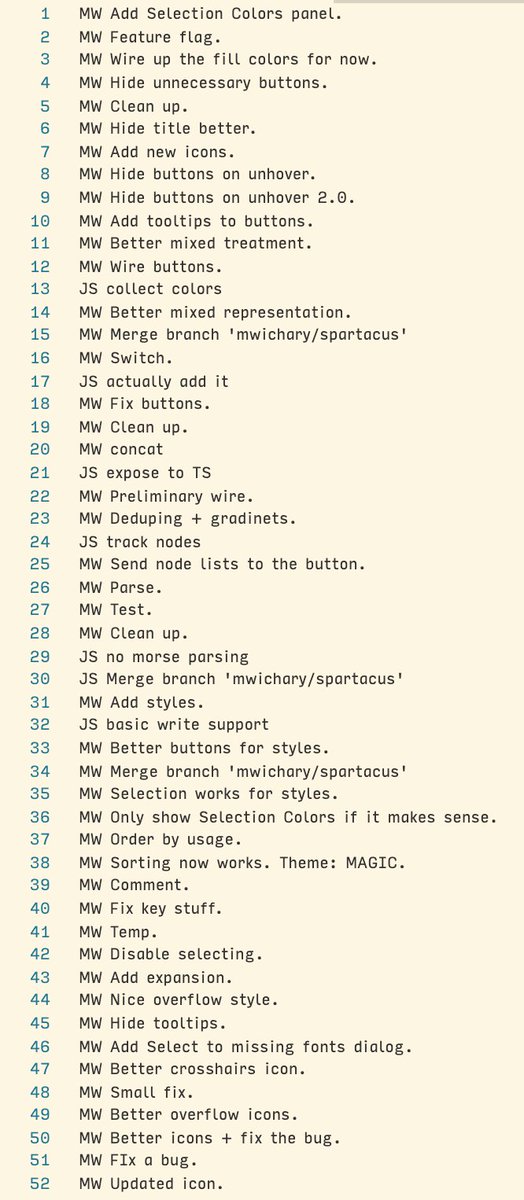
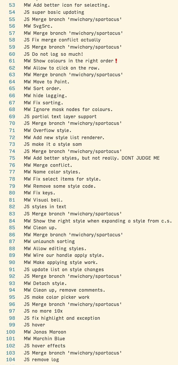
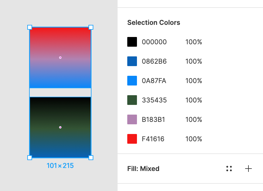
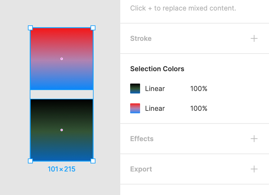
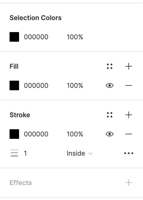
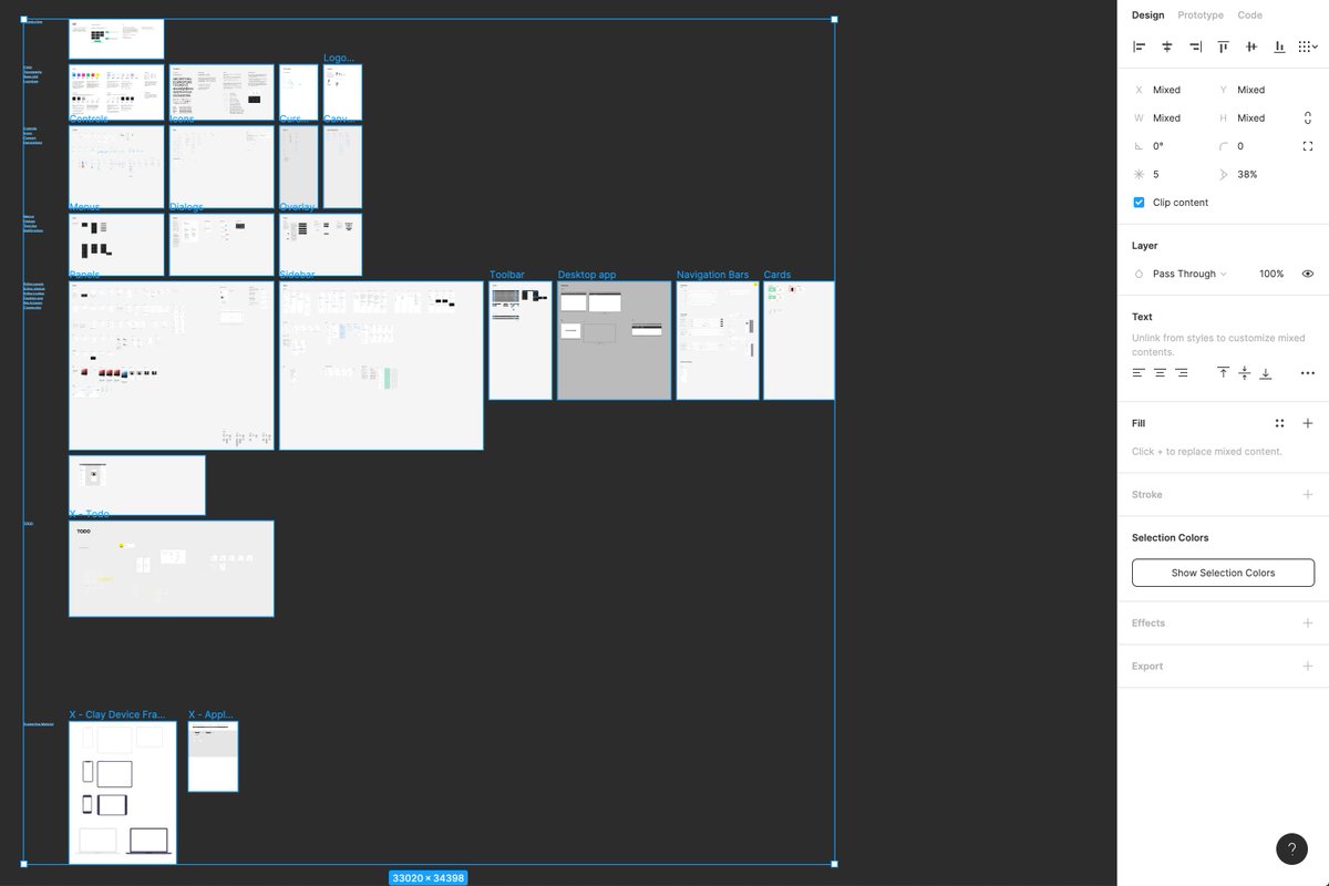
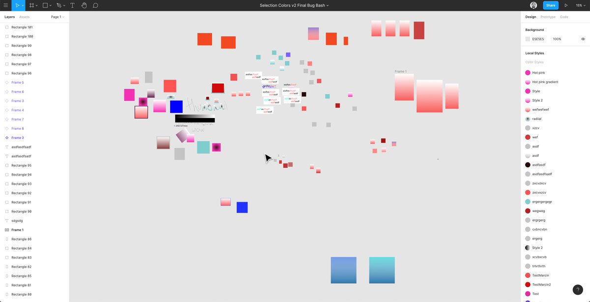
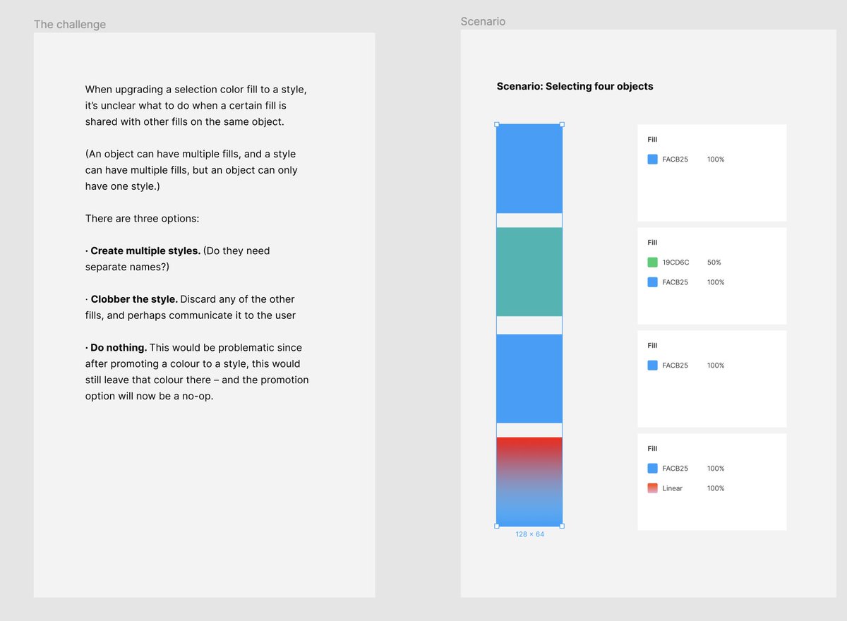
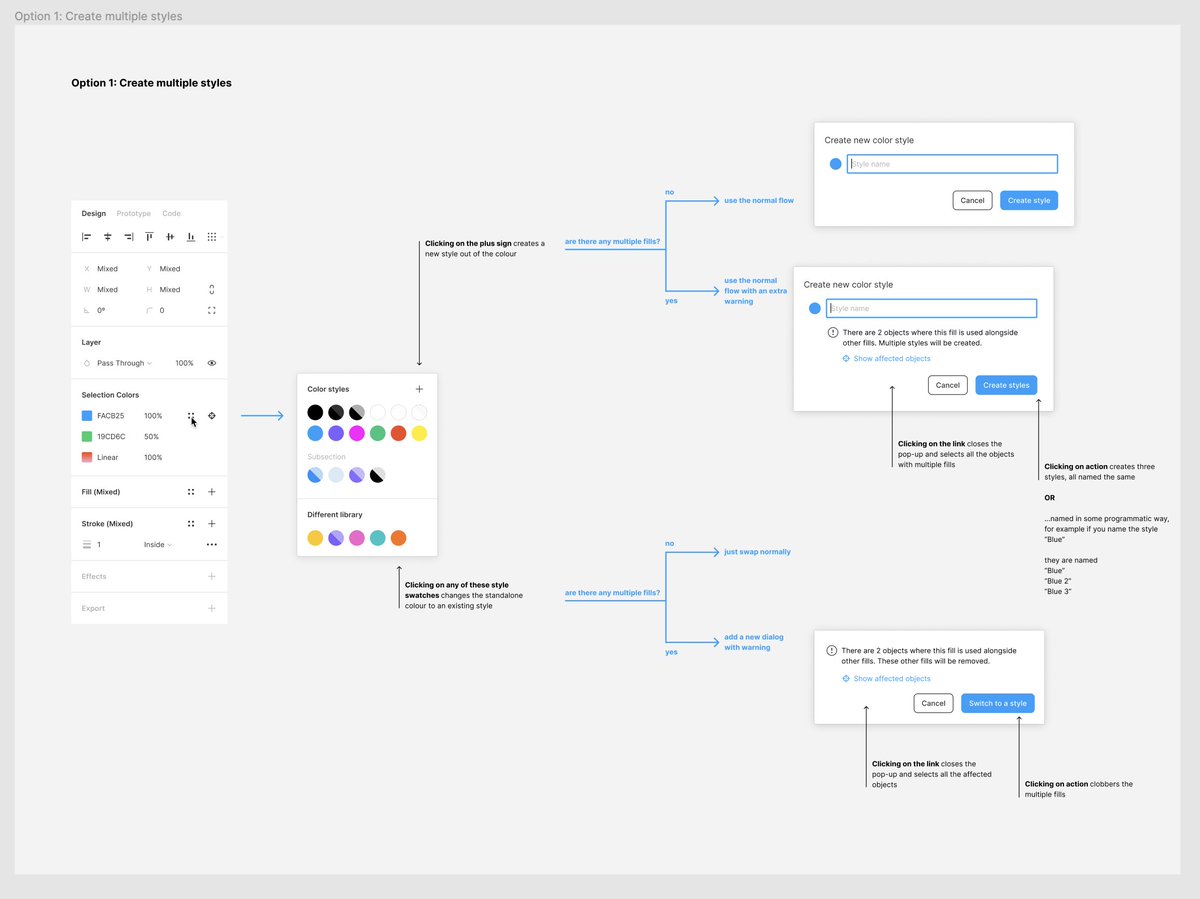
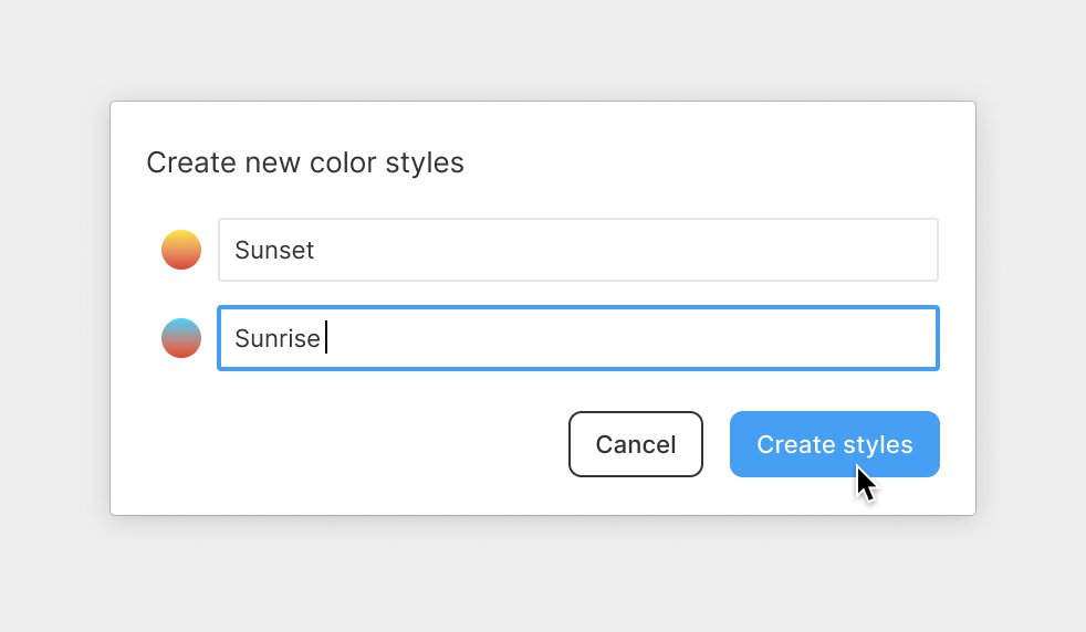
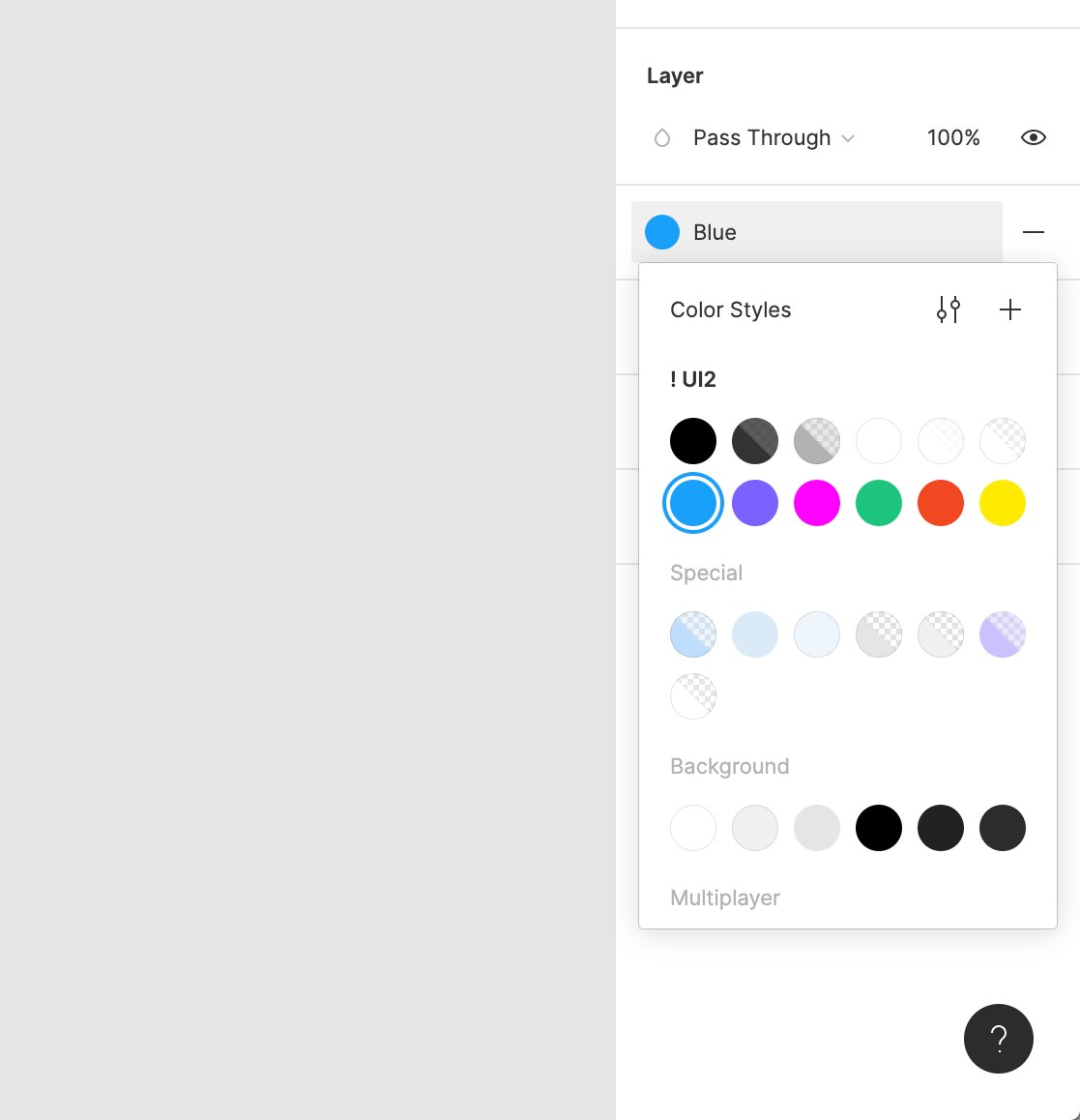
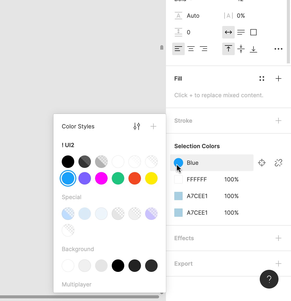
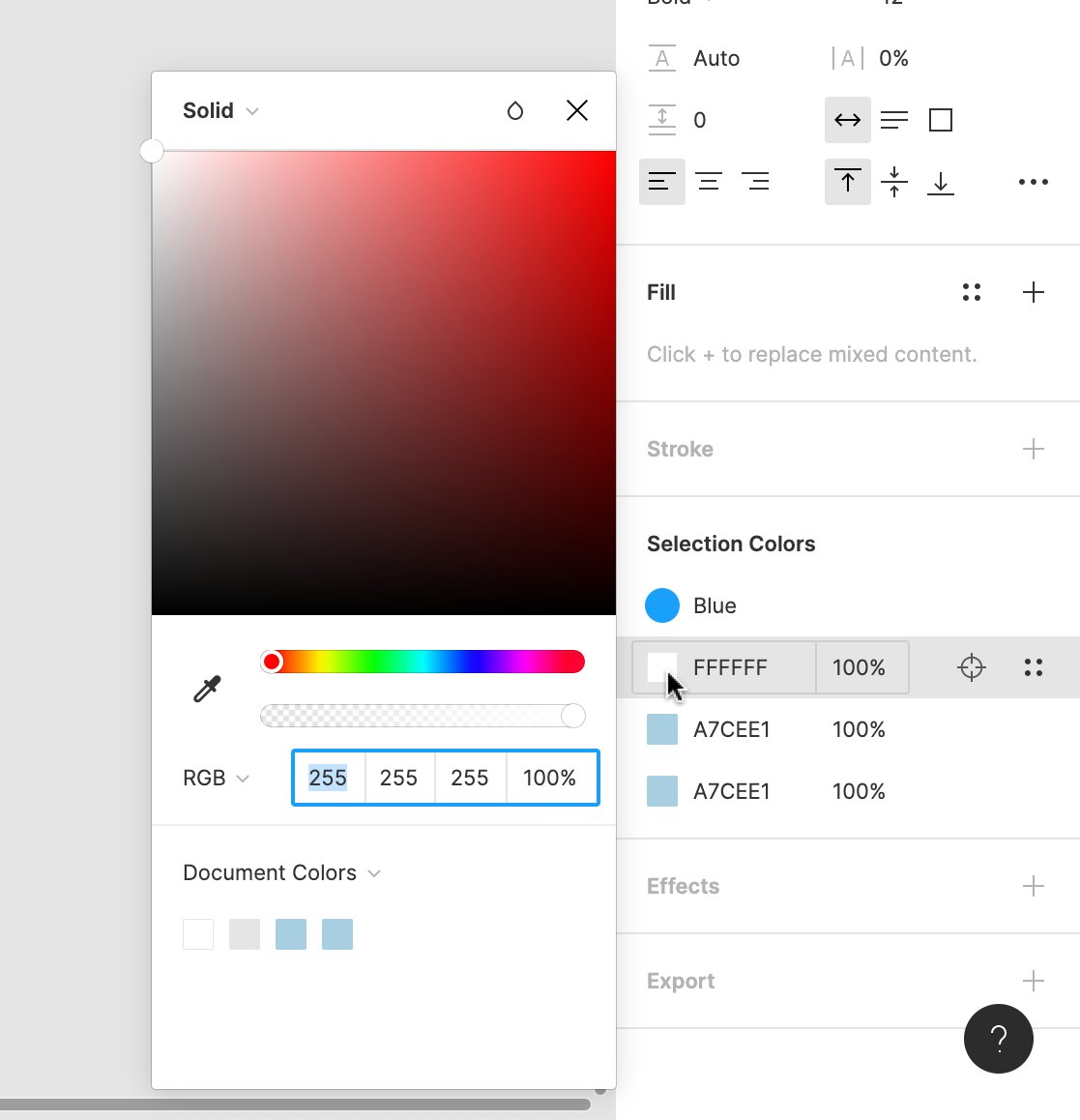
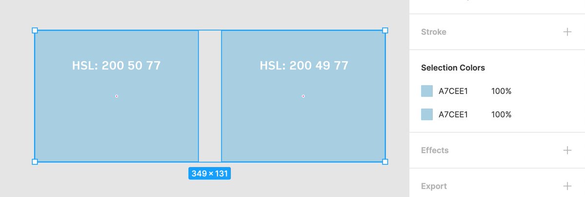
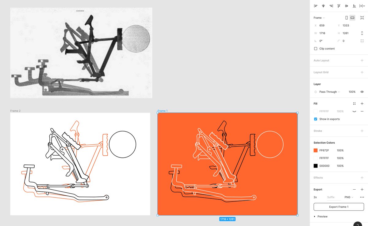
I’ll be updating this thread on some of the process and design details 👇 twitter.com Marcin Wichary @mwicharyWanted to share a bit of the process of building Selection Colors, a little @figmadesign feature I feel rather (maybe strangely) proud of.
(This was originally meant to be a blog post, but the Covid-19 situation is sapping my energy…) twitter.com
Marcin Wichary @mwicharyWanted to share a bit of the process of building Selection Colors, a little @figmadesign feature I feel rather (maybe strangely) proud of.
(This was originally meant to be a blog post, but the Covid-19 situation is sapping my energy…) twitter.com stewartsc @stewartscYou may have seen us launch a new @loom today. Often when these things launch, the process is kept very opaque. Kept hidden behind a lot of slick visuals and aspirational words. We thought It might be fun to try and demystify the process a little. Thread --> twitter.com
 George Kedenburg III @GK3soooo which one did you pick? 👀
if you’re curious, here is a little behind the scenes story time about how this all went down!
(thread)👇 twitter.com
George Kedenburg III @GK3soooo which one did you pick? 👀
if you’re curious, here is a little behind the scenes story time about how this all went down!
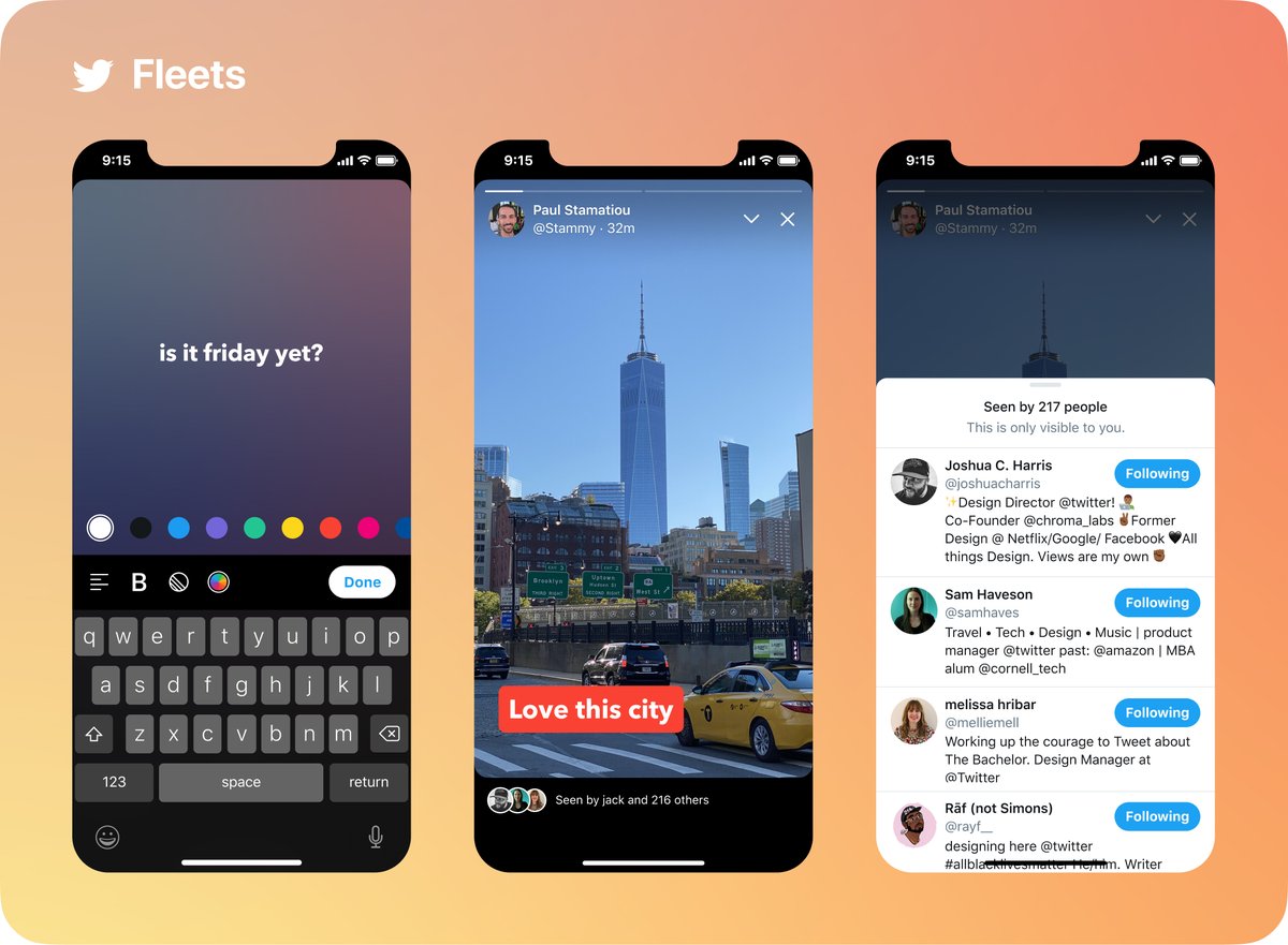
(thread)👇 twitter.com Paul Stamatiou @StammyI’m super excited to share what we’ve been working on at Twitter… Fleets! (as in fleeting thoughts) 🚀📷
It’s a new way to join the conversation and express yourself with a visual canvas that only lasts 24 hours. twitter.com
Paul Stamatiou @StammyI’m super excited to share what we’ve been working on at Twitter… Fleets! (as in fleeting thoughts) 🚀📷
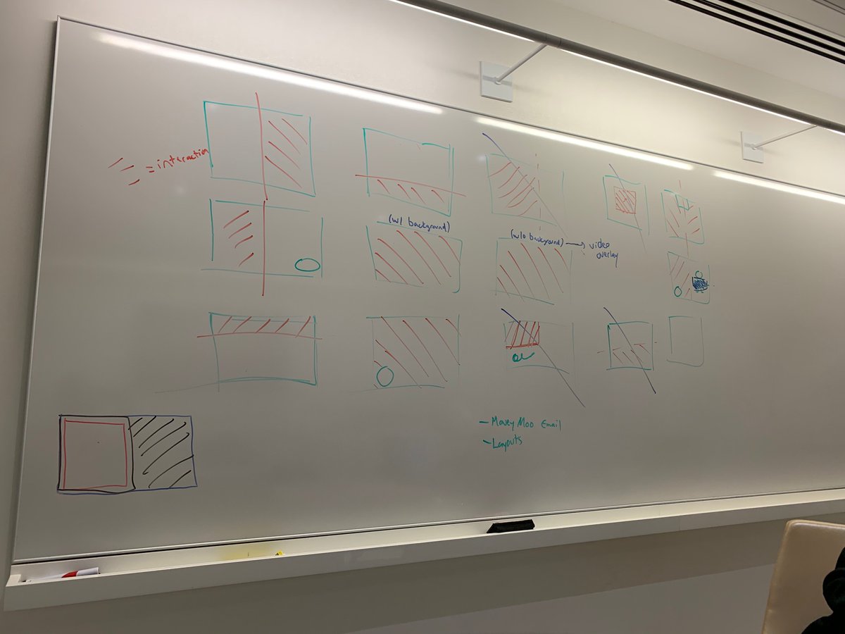
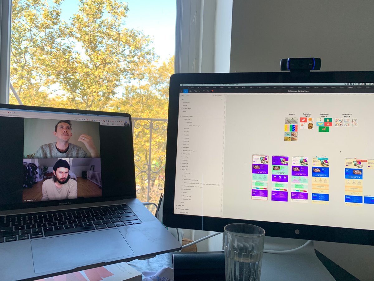
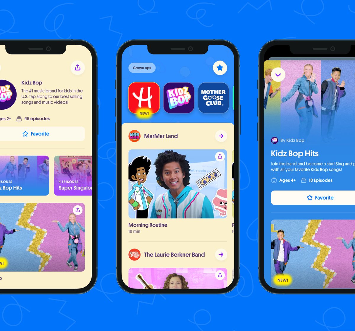
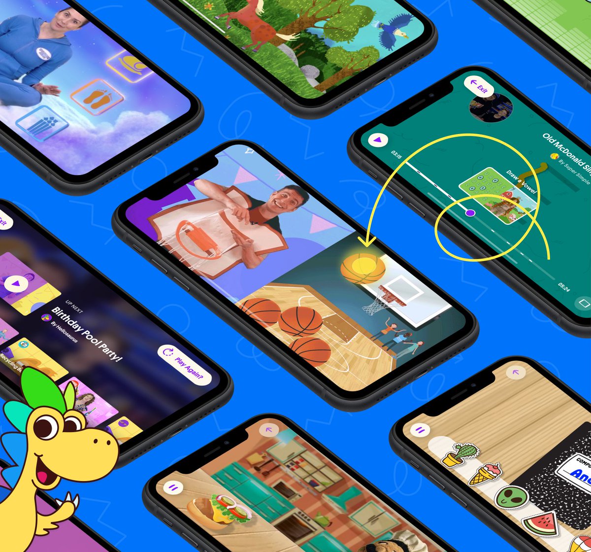
It’s a new way to join the conversation and express yourself with a visual canvas that only lasts 24 hours. twitter.com Kevin Twohy @kevintwohyAbout a year ago I got an email from @jamesruben. After leading product at HQ Trivia, he had an idea for how to use the magic of interactive video to reimagine what screen time could be for kids.
Here are some behind-the-scenes moments from making @playhellosaurus: twitter.com
Kevin Twohy @kevintwohyAbout a year ago I got an email from @jamesruben. After leading product at HQ Trivia, he had an idea for how to use the magic of interactive video to reimagine what screen time could be for kids.
Here are some behind-the-scenes moments from making @playhellosaurus: twitter.com


 Twitter @TwitterThat thing you didn’t Tweet but wanted to but didn’t but got so close but then were like nah.
We have a place for that now—Fleets!
Rolling out to everyone starting today. twitter.com
Twitter @TwitterThat thing you didn’t Tweet but wanted to but didn’t but got so close but then were like nah.
We have a place for that now—Fleets!
Rolling out to everyone starting today. twitter.com
 Twitter Research @TwitterResearchFrom Japan and South Korea to the US and Brazil, research has influenced today’s Fleet launch with the help of people across the world.
Find out what @kiyotoshi_y and @aidee_cantu learned from their international research. 🧵 twitter.com
Twitter Research @TwitterResearchFrom Japan and South Korea to the US and Brazil, research has influenced today’s Fleet launch with the help of people across the world.
Find out what @kiyotoshi_y and @aidee_cantu learned from their international research. 🧵 twitter.com


 Michael Bierut @michaelbierut@iDamianH @NickClement Every designer on my team for the last 29+ years was hired based on their portfolio plus between one and three (maximum) interviews. I find the idea of giving make-believe "exercises" depressing and boring (for me). I guess it's different in the world of button-free oven apps twitter.com


 Andrei Negrau @andreinegrauHey @figmadesign. Feature request: ability to change multiple fonts at once within a specific selection. Just like I can do now with Selection Colors feature. twitter.com
Wanted to share a bit of the process of building Selection Colors, a little @figmadesign feature I feel rather (maybe strangely) proud of.
(This was originally meant to be a blog post, but the Covid-19 situation is sapping my energy…)

 Allison Grayce @allisongrayce@skuwamoto @figmadesign mind sharing how you do things at a high level while I check your jobs page? 🙃 twitter.com
I recently codified my thoughts on a framework for speaking about product design projects. I don’t think there’s a one size fits all approach to these things, every company is looking for something different but would love to hear others thoughts. https://docs.google.com/document/d/1X85UBsuW84BoBzBjQ8TEGGIOkrhfrKG8UBKk3VvZcy8/edit?usp=sharing
 nlevinkatarinabatinaI recently codified my thoughts on a framework for speaking about product design projects. I don't think there's a one size fits all approach to these things, every company is looking for something different but would love to hear others thoughts. https://docs.google.com/document/d/1X85UBsuW84BoBzBjQ8TEGGIOkrhfrKG8UBKk3VvZcy8/edit?usp=sharing


 Pay what you can