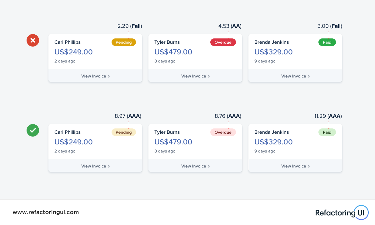
🔥 Achieving an accessible contrast ratio is very difficult when using white text on a colored background.
Using dark colored text on a soft colored background is much easier to make accessible, and usually looks better to boot 👌
Sign in to add notes...
Sign in to manage galleries...


 Pay what you can