A quick beginner's guide to CSS Media Queries
THREAD🧵
Media queries plays an important role in Responsive Web Design
Though this is not the only use of it. Media queries can also be used as
- Apply different styles for different media types
- Orientation (landscape or portrait mode)
- Resolution
In this thread, our point of focus will be using Media Query in order to make a web page responsive.
Sounds interesting? Let's go👇
Let's see an example into action. So that we can build strong hold on the concept
"""
@ media screen and (min-width: 600px) {
div {
background: green;
}
}
"""
In this case the background will be green whenever the screen width is 600px of greater than 600px;
0:000:00
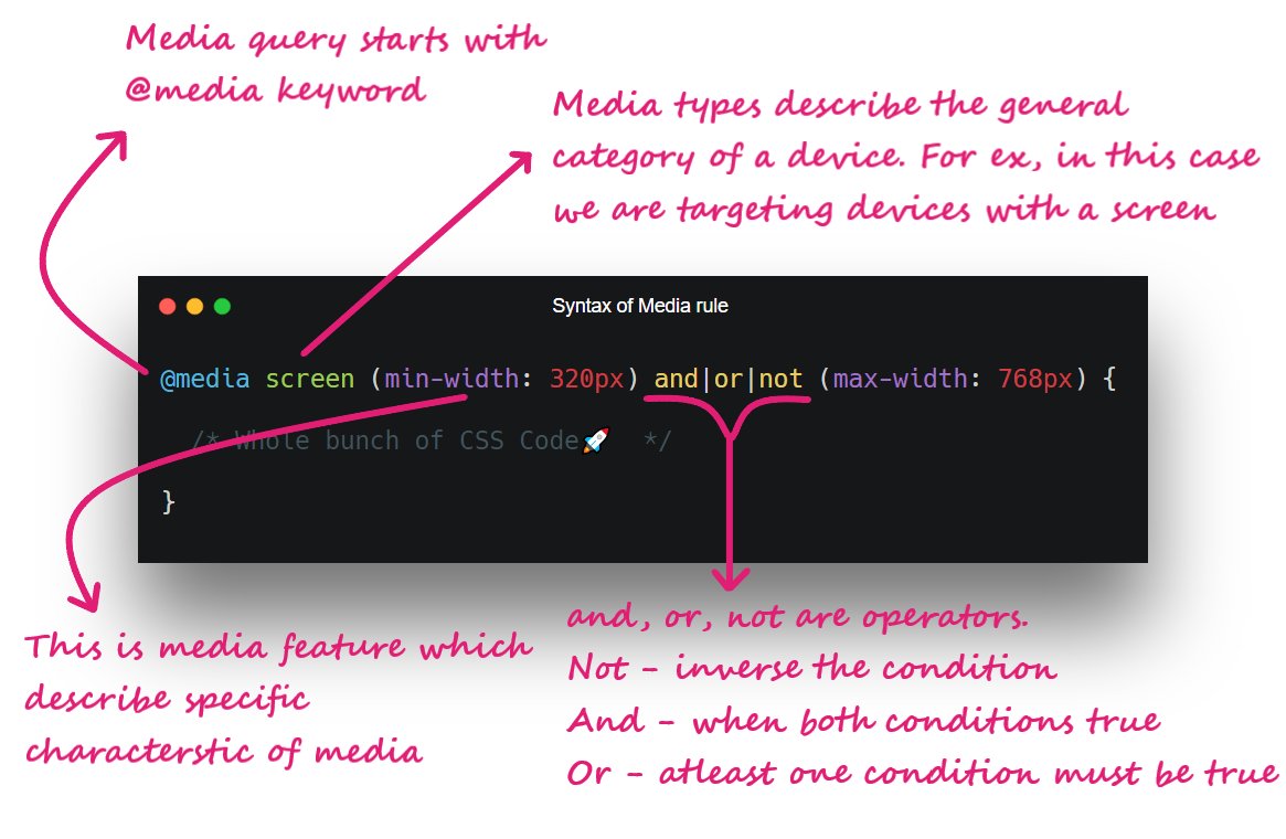
You can also combine two media features using "And", "Not" or ","
For example:
"""
@ media screen and (min-width: 600px) and (max-width: 900px) {
div {
background: green;
}
}
"""
In this case, the background will be green between 600px to 900px width
0:000:00
You can try bunch of media features
- any-hover
- color
- height
- width
- grid
- aspect-ratio
- orientation
- resolution, etc...
We can also write the nested media queries:
When min-width = 600px and user hover over element then solid black will create around div.
You can also invert the media query by simply adding the "not" keyword after @ media
Sometimes managing media queries might be a tough task.
So whenever you're working on pure CSS, make sure to check some standard device viewports and try to minimize number of media queries in your code
 menu
menu


 Pay what you can