10 keys to nailing responsive design in @figmadesign
Aka: How to become your engineering team's favorite designer 👇
0:000:00
1. Start with mobile
• It's easier to expand on your designs than to simplify
• You're defining most elements as 100% width which means you just have to communicate the max-width of something as you move up breakpoints
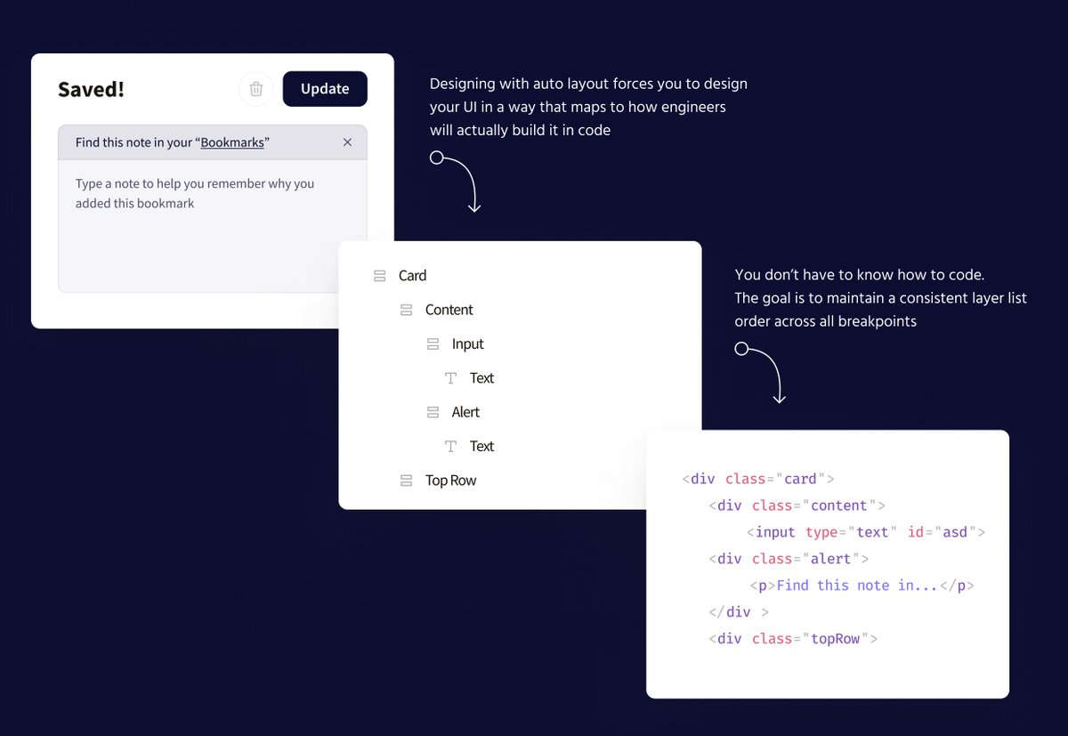
2. Keep a consistent layer list order across breakpoints
• This ensures you're not requiring changes to the HTML structure
• You can accomplish a lot by simply updating auto layout directions, padding, spacing, and your styles!
• Showing/hiding things is totally fine 👍
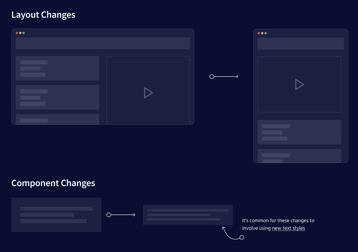
3. Communicate WHERE your changes are happening at each breakpoint
• Are you making changes to the page layout itself?
• Are you making changes to individual components?
Don't assume developers can spot everything that's changing from breakpoint to breakpoint
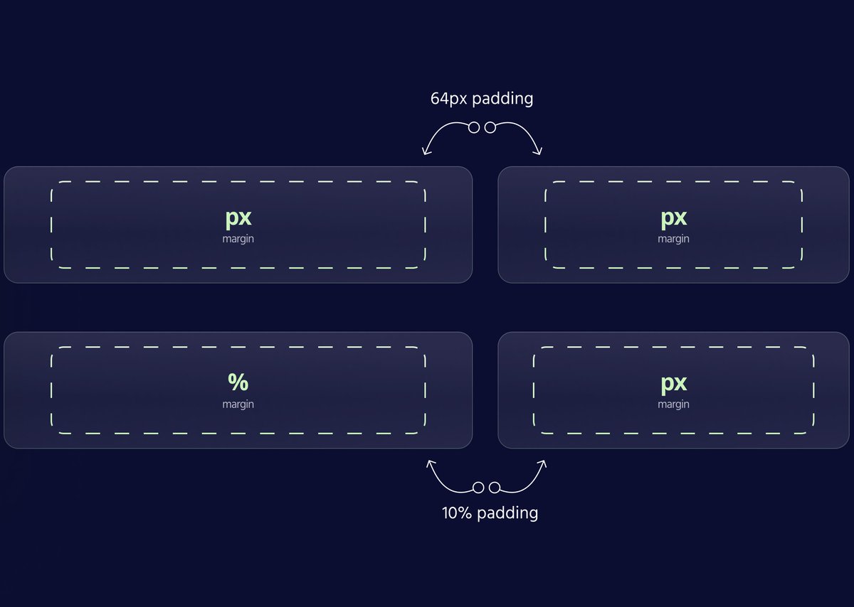
4. Take advantage of responsive units
• Do you mean 64px? Or do you actually mean 10%?
• Make sure engineers know what your intentions are.
(You can add a simple sticky note to over-communicate how a certain element should resize)
5. Decide what is fixed and what is fluid
We often have 3 variables to consider:
1) Padding from parent container
2) Size of our UI element
3) Space between elements
As device sizes change, at least one of these variables has to change.
👆 Communicate which one it is
6. Auto layout all the things...
• Your designs are almost certainly going to be implemented with flexbox so using auto layout forces us to think through how each component will actually be built
• Setting things to "fill container" makes our components inherently responsive
7. See things in columns and rows
• As device sizes shrink, a common pattern is to take elements that were once in a row, and stack them vertically within a column
• If you're building with auto layout, this is a single button to click 👍
8. Organize your files by breakpoint
• I then add a note in front of each breakpoint to document what design changes are being made
• Make sure you know the breakpoints your devs are using and how they are referring to them!
9. Design at the smallest possible width within a given breakpoint
• Sure, your UI looks great at 1024px. But these layout rules have to work all the way down to 768px as well...
• Make sure your designs work in the worst-case scenarios! I'll show max/min sometimes 👍
10. Use variants to define how components evolve at different breakpoints
• This strategy can be used for individual components or entire layouts!
• This also makes updating your UI a breeze as changes are inevitably made
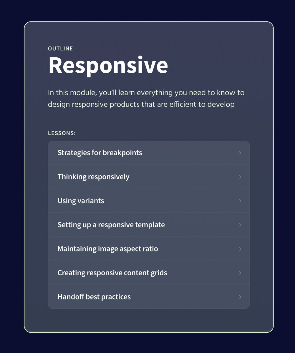
If you couldn't tell... I'm having way too much fun working on the responsive module for @figmaacademy 😅
We're going deeeeeeeeep...
If you found a little nugget of goodness from this thread…
Click into the first tweet below and pass it along 👇
TLDR:
• Over-communicate what is changing from breakpoint to breakpoint. Don't assume developers can spot the difference
• Use auto layout and think strategically about your layer list
• Use variants for component and layout changes
• Design around worst-case scenarios
 menu
menu


 Ridd 🏛 @Ridderingand10 keys to nailing responsive design in @figmadesign
Aka: How to become your engineering team's favorite designer 👇 twitter.com
Ridd 🏛 @Ridderingand10 keys to nailing responsive design in @figmadesign
Aka: How to become your engineering team's favorite designer 👇 twitter.com
 Pay what you can