I've recently been obsessed with trying to figure out how to put a shadow on a white card style on top of a white background and have it not look bad. It's typically tough to do, usually they look muddy so we either opt for a light grey background or just a simple border.
But awhile back while I was exploring how to make a white background app ui that also utilizes shadows for hierarchy I discovered a method for making this work and it involves using a stack of 3 shadows
So the reason shadows typically struggle on white is because of the lack of contrast or the presence of too much contrast. A light grey background always works so nicely so I decided to look there for inspiration.
It starts with adding literally a light grey background as a shadow and heavily blurring it, this creates a background-esque appearance just around the card it's applied to.
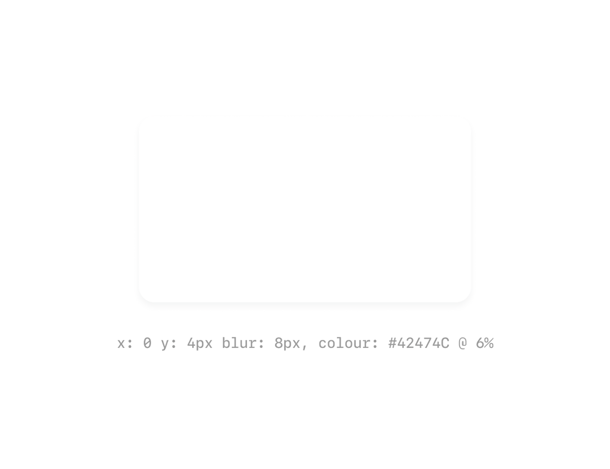
Next, you add your "regular" shadow, this can be a faded black or in my case a dark grey with a subtle blue tint to it.
Lastly, to really punch up the contrast and make it work more reliably we can add a shadow that acts like a border. Why this instead of an actual border? Well I find with it being a 1px blur it adds just a touch of softness to the outline that a border just can't quite deliver.
Add voila 🎉 we have a white on white shadow card style that doesn't feel muddy but that adds some dimension that we wouldn't get from an outline.


 Pay what you can