Today is the day @krisbogdanov and I design, build & launch a product in a single day.
I am going to be sharing my journey from the product & design side of things.
So if you are interested in what goes into designing a product/website (quickly) make sure to follow along!
#1 - The Idea
The idea is quite a simple one.
To build a place that collects launch tweets in a single place, so that you can find social favourites, hidden gems or inspiration for your next launch.
#2 - The Plan
I am going to skip over the typical logo/branding process for now and dive straight into website design.
This will allow me to send designs over to Kris asap so as to not hold him up on his end.
Key things over the next hour or 2
- Colours
- Fonts
- Layout
- Vibe
#3 - Time
One of the biggest factors of any project is time.
How much time do you have to design.
How much time is there to build.
How much time is there to fix.
Time can dictate how intricate or complex a website can be. and so, I want to keep things simple... but beautiful.
#4 - Choosing a typeface
A typeface (or font) can be one of the hardest parts of any design.
Because this one small decision can say so much about your design.
I'm trying to stick to Google Fonts to keep things super simple for Kris.
#5 - Initial Layout
Landed on a layout/direction that I quite like, without it being too complex/hard to implement.
Next steps:
- Figuring out colours/style
- Confirming Font choices
- Fleshing out the "above fold" view
- Adding a search & filter row
#5 cont -
This initial screen does so much.
It:
- Shows the initial structure
- Shows the grid layout
- Shows the card spacing, padding, and flow
- Lays the foundations of potential "container" style
- Hints at the relaxed, casual tone of voice
#6 - Live Data
We often make the mistake of designing for the best use case. Where in reality, that is rarely the case.
So, putting in some live-data/examples to test how I want the grid to look.
#7 - Typescale
Settled on a typescale of 1.25 with a base-size of 17px.
Now to create the multiple weights I want to use, and start creating the colour palette.
#8 - Homepage Done (for now)
The homepage is about 80% complete. There are still things I want to change, and polish to add.
But I need to move onto other pages and the logo/branding.
Right now, due to time, good enough is good enough for me.
#9 - Logo Sketch’s
These days, I don’t get to design logos as much as I would like to.
Usually I like to spend time exploring my options but, this time I’m going to have to keep myself to 1 hour tops…
Let’s get it.
🤞
0:000:00
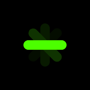
#10 - The Logo
An idea for a logo can often come quickly, or not.
Today was one I was drawing a blank, so just started doodling, then messing around with shapes in @figma
Then, I asked myself "What's the user doing" - Tweeting an announcement.
So let's show that, visually.
#10 cont -
Again, due to time, good enough is good enough for me.
So, I am going to polish this one up, finalise the spacing, positioning, scaling & colours, test it in place, and then send it to @krisbogdanov to add it to the site!
*Small differences can be huge
Sidenote - This version gave me heavy @AlexLlullTW vibes 😘
#11 - Logo colour combos
A few variations, though I'm not 100% sure I will stick with yellow. But I do like the simplicity of Black + 1 colour
#12 - Logo done
the "final" logo is done for now.
Onto creating the social stuff & setting up @ProductHunt launch for tomorrow


 Pay what you can