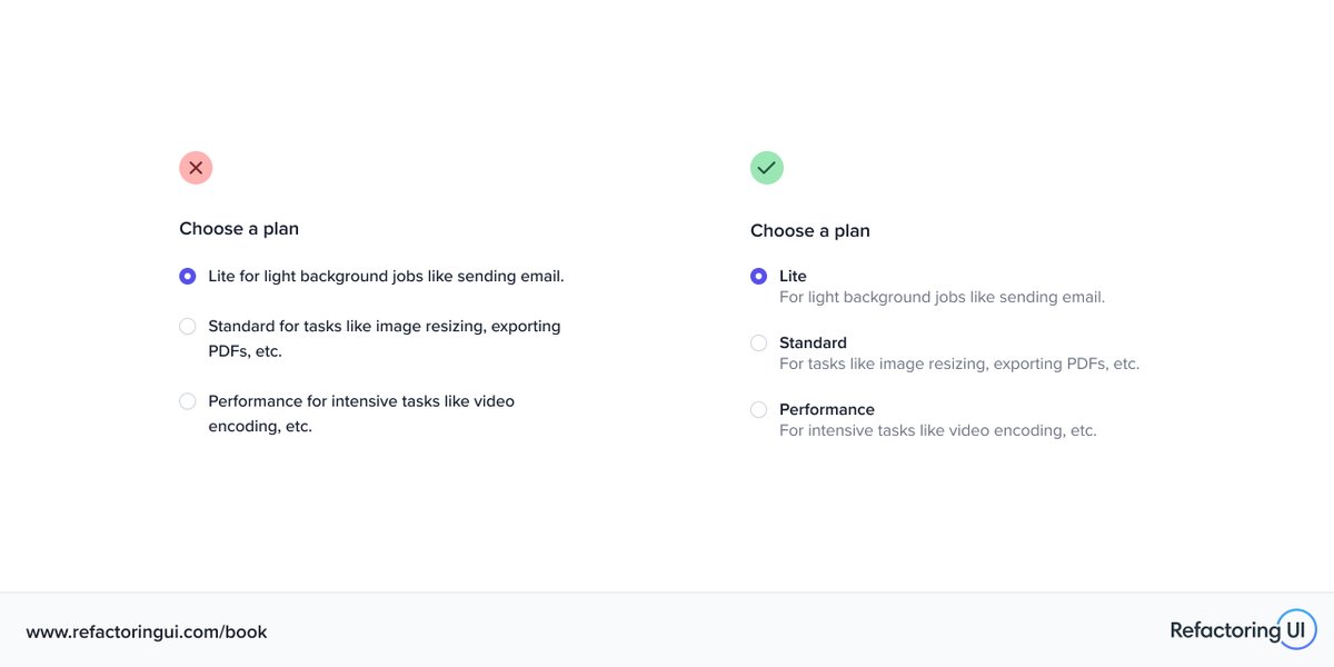
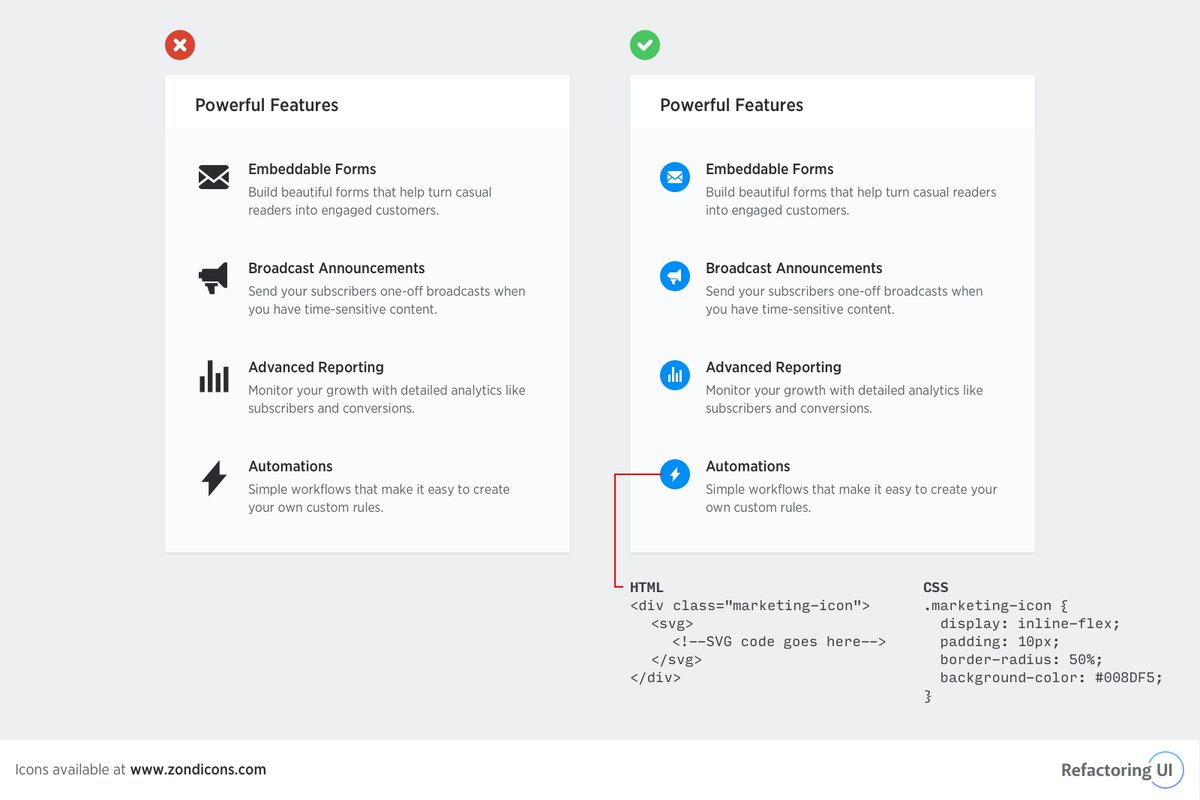
🔥 Labels for checkboxes and radio buttons can be more complex than just a simple string.
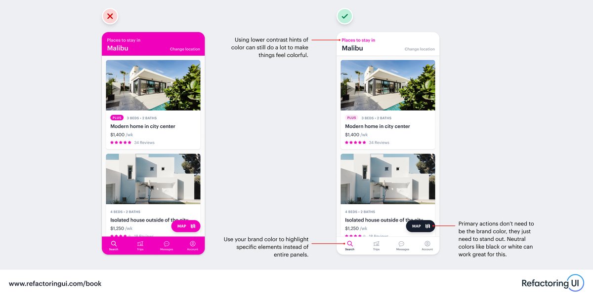
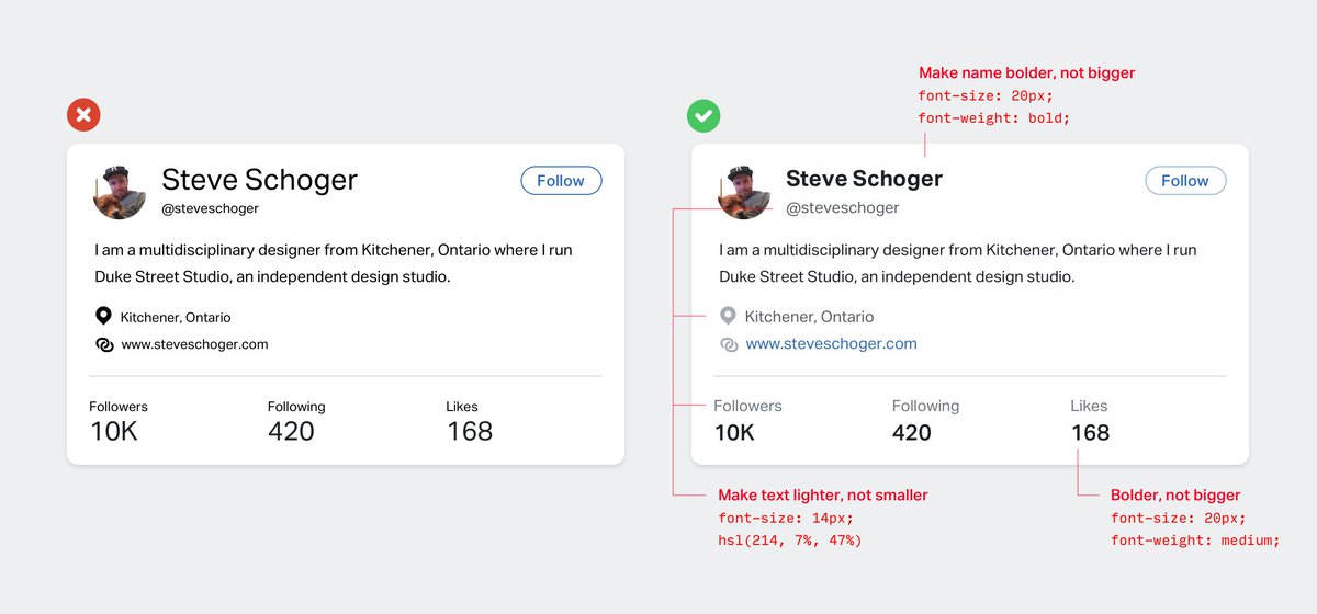
Using techniques like color, weight, size, and position to emphasize what’s important can help create a pleasant visual hierarchy that looks 10x more polished.
🔥 Labels for checkboxes and radio buttons can be more complex than just a simple string.
Using techniques like color, weight, size, and position to emphasize what’s important can help create a pleasant visual hierarchy that looks 10x more polished.
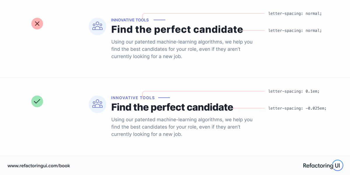
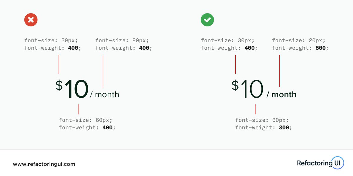
🔥 One small design detail that new designers often overlook is letter-spacing.
Tricks like making headlines slightly condensed or giving small uppercase text a bit more space can go a long way towards giving a design that final level of polish.
🔥 One small design detail that new designers often overlook is letter-spacing.
Tricks like making headlines slightly condensed or giving small uppercase text a bit more space can go a long way towards giving a design that final level of polish.
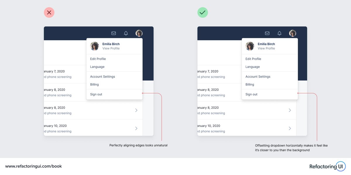
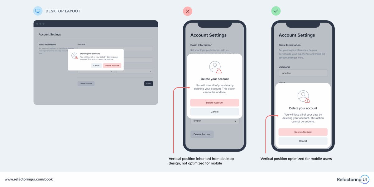
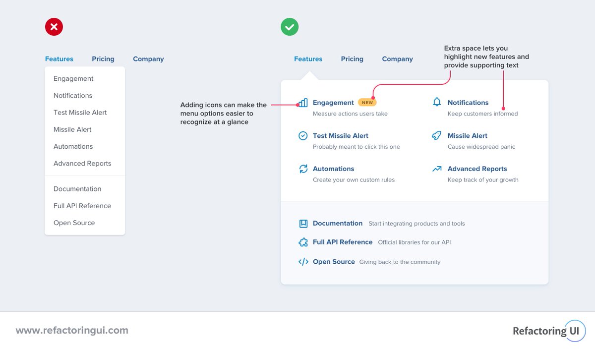
🔥 When making a design responsive, don’t stop at simply making things fit on smaller screens – look for ways to borrow usability patterns from native mobile apps, too.
For example, anchoring modals to the bottom of the screen instead of the center, making them easier to reach.
🔥 When making a design responsive, don’t stop at simply making things fit on smaller screens – look for ways to borrow usability patterns from native mobile apps, too.
For example, anchoring modals to the bottom of the screen instead of the center, making them easier to reach.
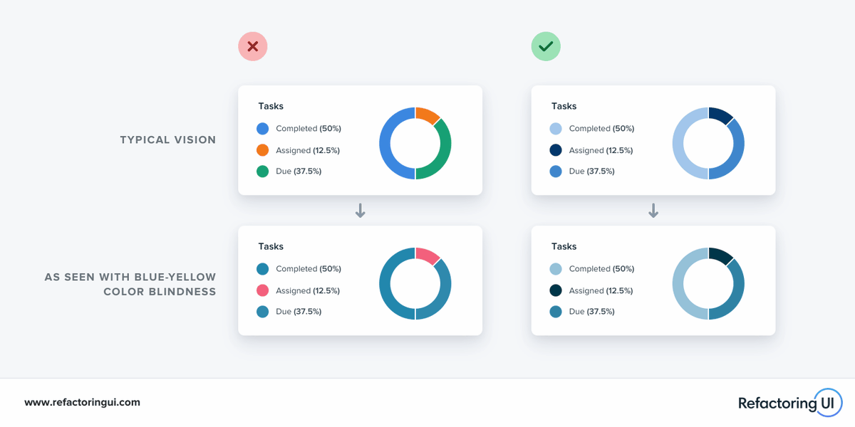
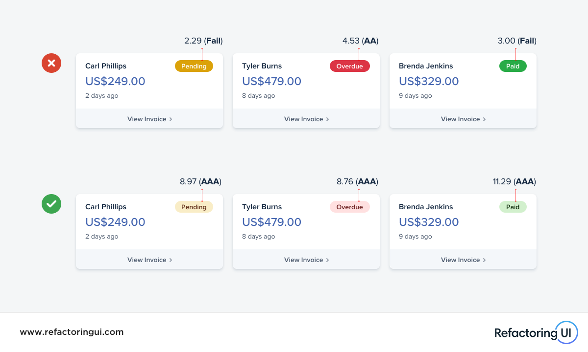
🔥 When designing a chart, using a variety of colors might seem like a good idea at first but it can make it a lot harder for people with color blindness to interpret the data.
Instead, try using multiple shades of the same hue — it’s more accessible and looks better too 🥳
🔥 When designing a chart, using a variety of colors might seem like a good idea at first but it can make it a lot harder for people with color blindness to interpret the data.
Instead, try using multiple shades of the same hue — it’s more accessible and looks better too 🥳
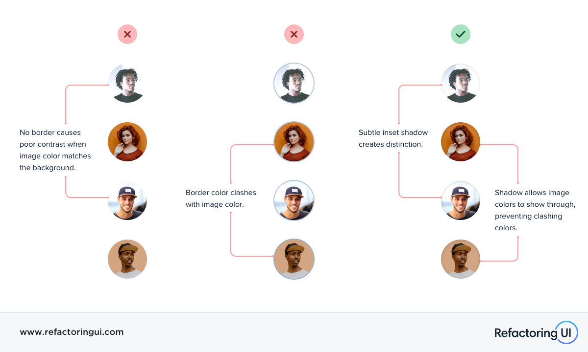
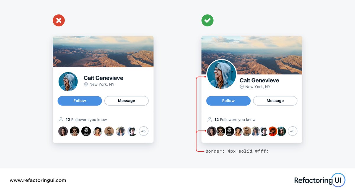
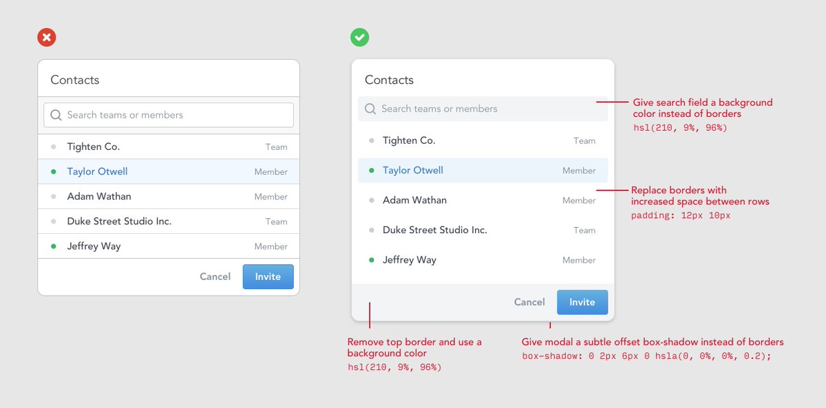
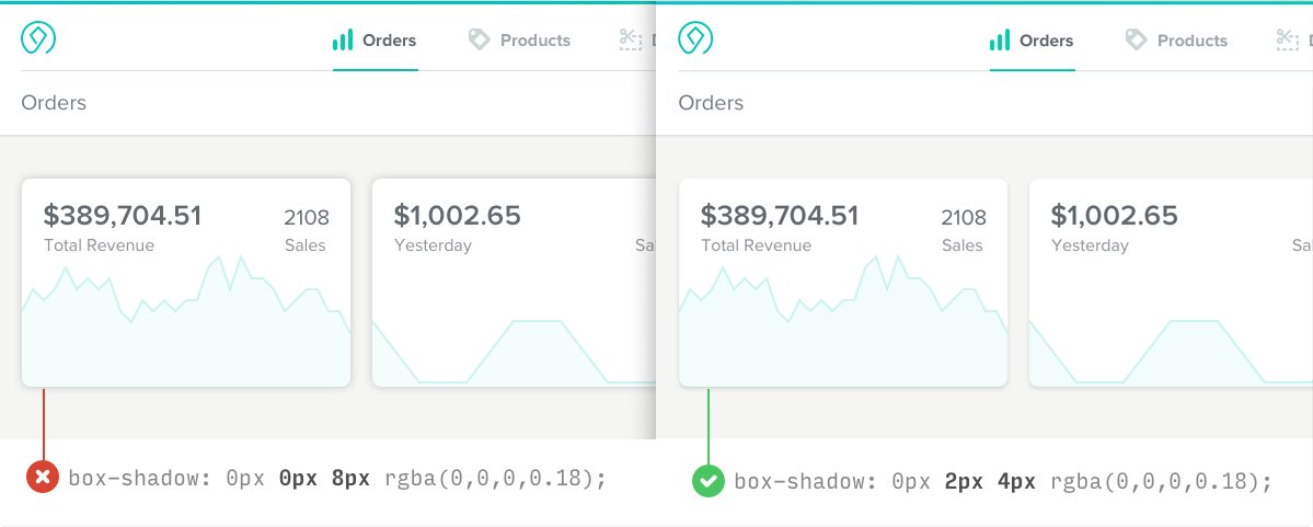
🔥 If you’re working with images that sometimes bleed into the background, try using a subtle inner shadow to create some distinction instead of a border.
Borders will often clash with the image, while most people will barely realize the shadow is even there.
🔥 If you’re working with images that sometimes bleed into the background, try using a subtle inner shadow to create some distinction instead of a border.
Borders will often clash with the image, while most people will barely realize the shadow is even there.
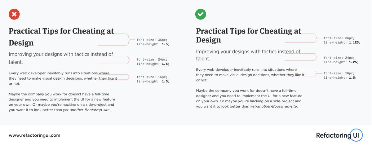
🔥 Using the same line-height for all text is a very subtle but common mistake. 1.5 may work great for body copy, but as text gets larger, your line-height should get tighter.
🔥 Using the same line-height for all text is a very subtle but common mistake. 1.5 may work great for body copy, but as text gets larger, your line-height should get tighter.


 Pay what you can