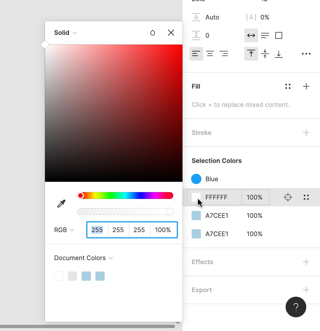
The solution was to “freeze” the list when the colour picker was open. Only the moment you closed it, the list would get cleaned up again. (We hoped that people would figure it out.)
0:000:00
I’m vastly oversimplifying what “freezing” was (and honestly, not sure I fully understand it myself). But @SickingJ got it to work, and this enabled trading/swapping colours.
0:000:00
It required quite a bit of thinking and experimenting, though – see a bit of a doc that I wrote out just for the two of us to process this.
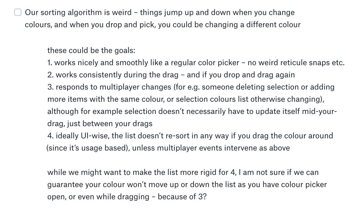
We also had to solve a problem of stopping aggressive sorting. Left to its own devices, it was unnerving when your color moved up and down as you were changing it.
(This is an earlier exploration where this exact thing happened.)
0:000:00
We also had to solve a problem of you dragging a colour through existing colours – by default, they would automatically get fused together *as you were dragging*, which was logical… but confusing and destructive!
0:000:00
At the same time, we had to think about multiplayer. What if someone else changed the colour during any of the above – even in the middle of your drag? Or deleted the objects? Or edited the text you were changing?
We continued cobbling together the prototype with code we were increasingly sure wouldn’t ever make it to production. If you‘re curious, here are all our commits. (I actually became a better engineer thanks to this process – thanks, @SickingJ!)
Then we brought the prototype back to crit, and we learned a lot once again.
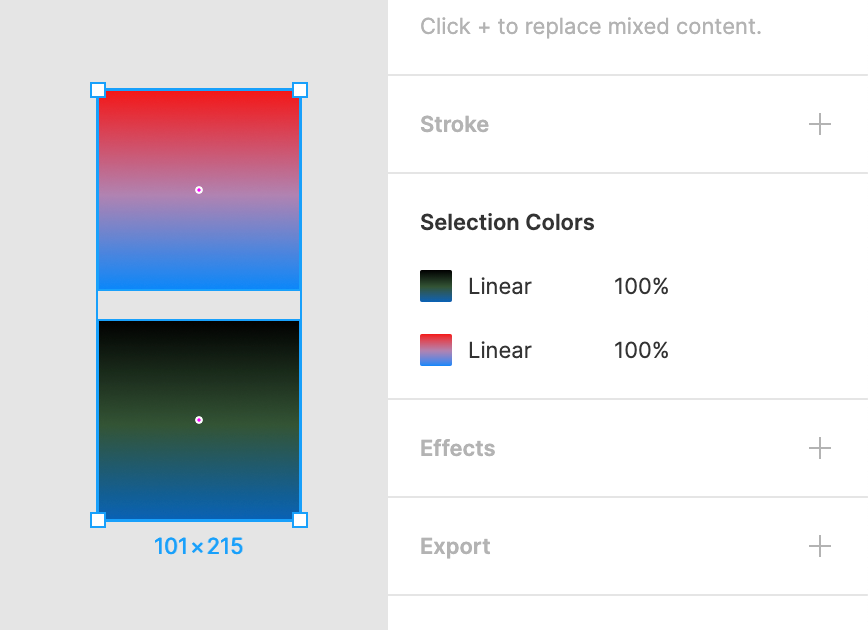
Mostly, our decision to decouple gradient colours was wrong – that’s just not how others thought about gradients.
Second of all, it was annoying that you could select and go deeper into a stack of colours, but not have a way to easily get back.
0:000:00
There were also smaller things. My overflow icons were confusing (one looked like a checkbox), and our triggering was off.
(That was a tricky one, too. Imagine you have just one object with the same Fill and Stroke – should SC show up, or would it be too much?)
We decided to build Selection Colors for real a few months later, motivated partly by… Auto Layout. We were planning to change the frames to have fills, and that ruined an existing feature where you could easily colorize an icon just by selecting a parent frame.
I had nothing to do with code any more, save for an occasional UI fix or an icon swap. The real work was done by engineers on our team – @jessieteaa, @thejoannachen, @kenrickrilee.
Immediately, they found some more real-life problems, one of them being performance.
(Long story short: If you make a really large selection, we don’t show SC by default, because the list can get overwhelming, and the interactions quite slow.)
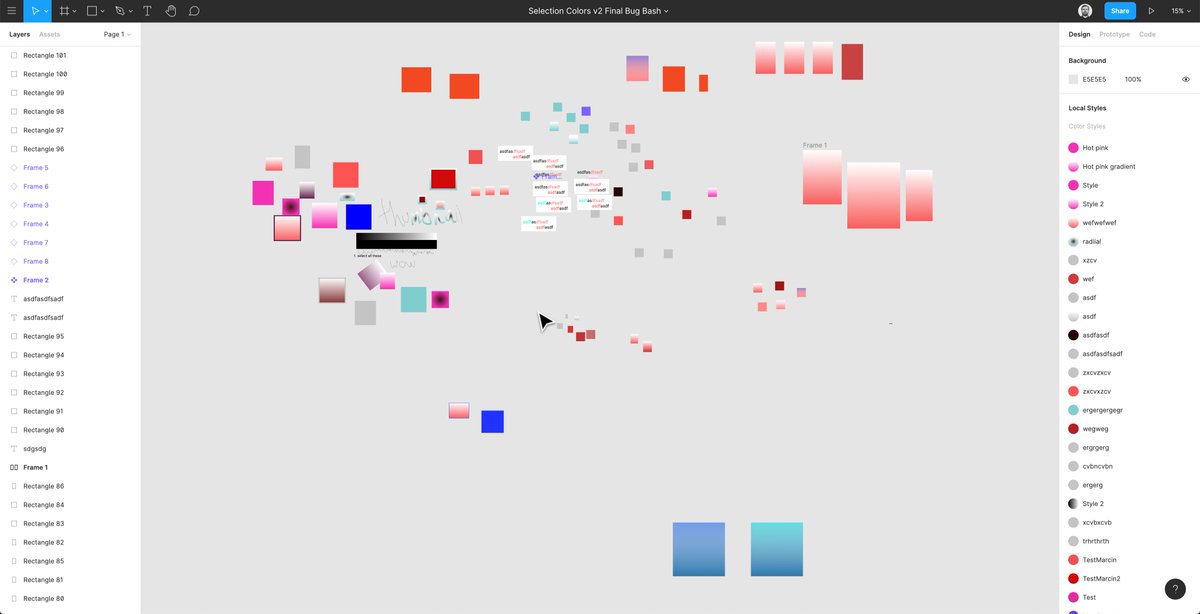
BTW here is a random fun screenshot from one of the few bug bashes. (I have tons of temporary Figma files like this. The style names here are particularly hilarious.)
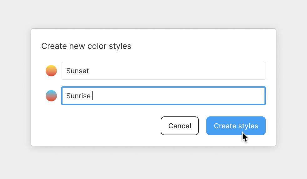
But the biggest challenge was promoting to styles.
In our maker-week version, we built this “one-click style creation” – a fun experiment.
0:000:00
In real life, we already had an existing UI for that… but we also had a problem.
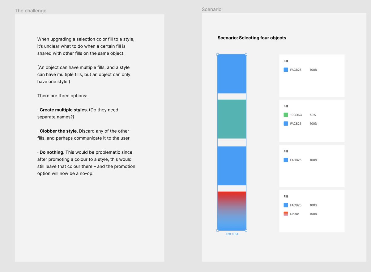
In Figma, an object can have multiple fills. And a style can have multiple fills. But an object cannot have multiple styles.
If you choose a colour to promote to a style, that colour could also be shared with other colours in some layers. What should we do when that happens?
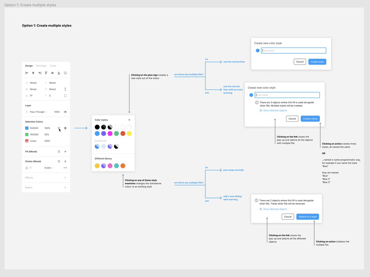
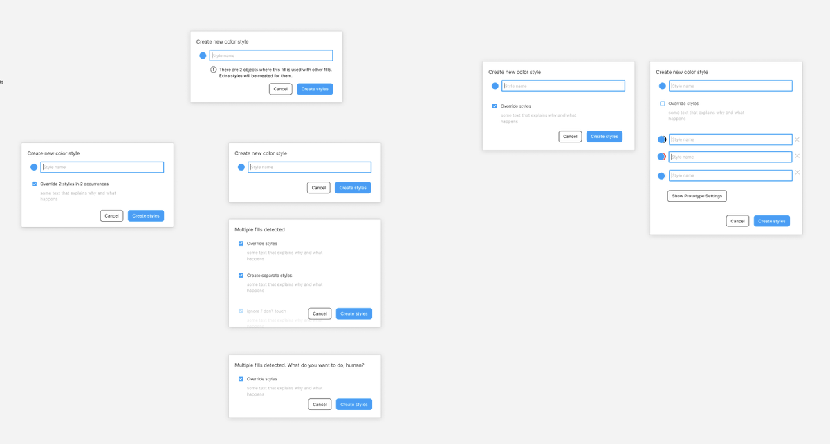
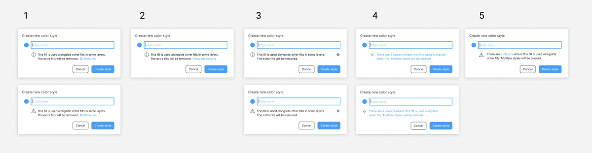
This was the most “traditional” UI work I did on the project.
I collaborated with @thejoannachen and @nikolasklein and @rsms to figure that one out. Here are some explorations.
(The winning main flow came from @rsms and is beautiful in its simplicity.)
We also made a hard decision not to ship this part – and a few other things – in time for Config where SC v1 premiered, giving us a bit of time to get them right.
But as of last week, Selection Colors v2 is now true to its original vision, meticulously crafted to perfection, flawless in every regard!
Just kidding. Of course it’s not. There are a few things I don’t like about it, and I won’t even share them all because it’s too painful. 😬
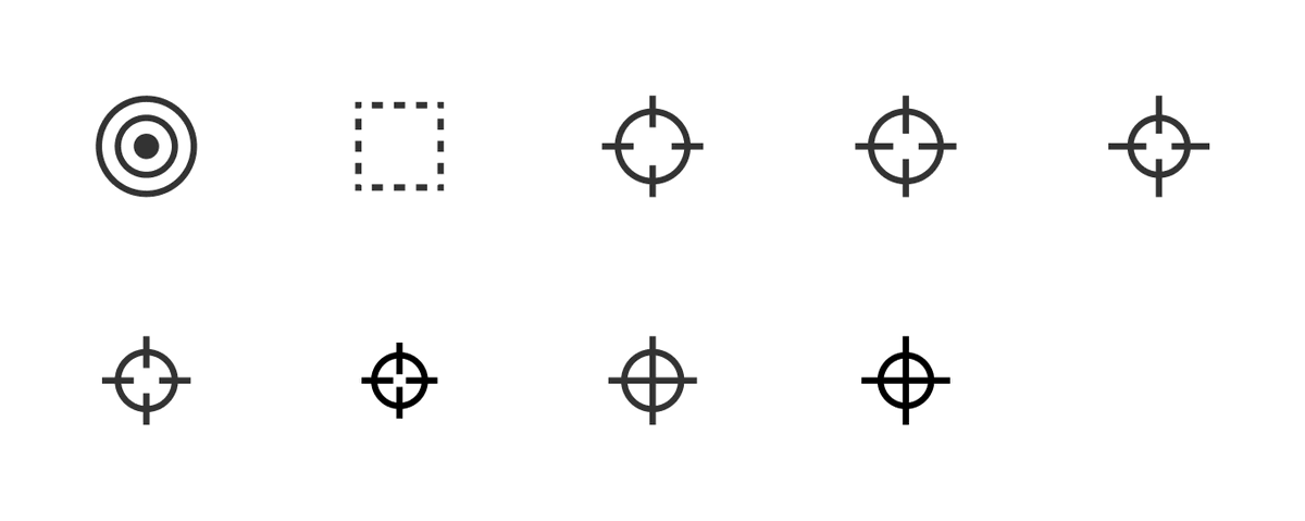
1. I never figured out how to solve the “go back to master selection” problem. On top of that, the icon is not great – I don’t like anything reminding people of firearms – but we couldn’t think of anything else.
2. I introduced a deliberate inconsistency. In normal use of styles, the pop-up shows on top of selection (nicer for your fingers). But here, we decided to move it aside to be consistent between colours and styles, and to not cover the list you care about.
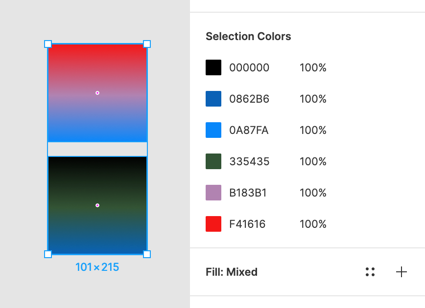
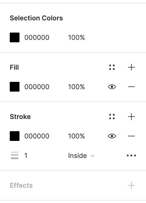
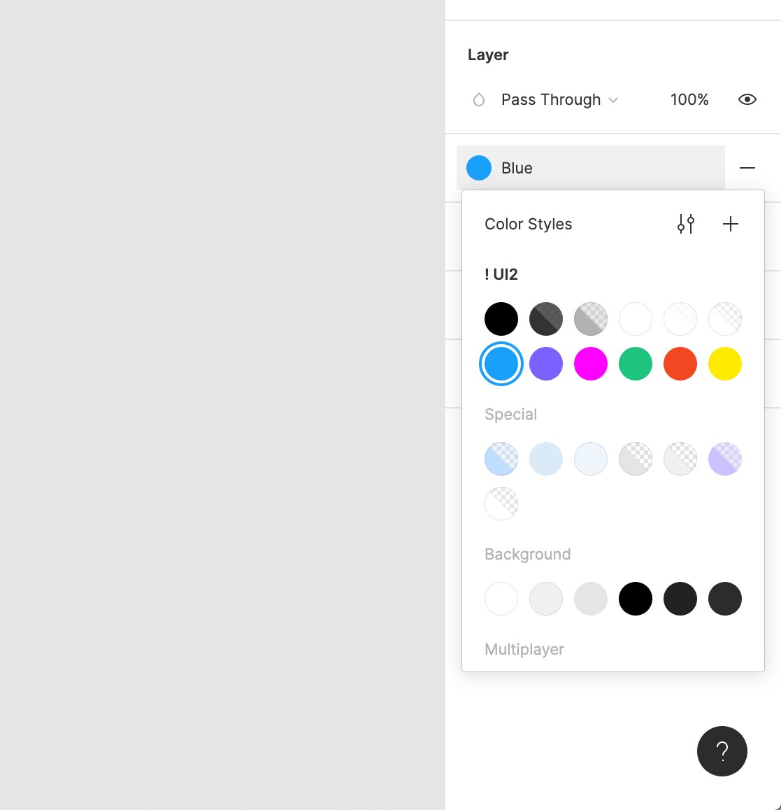
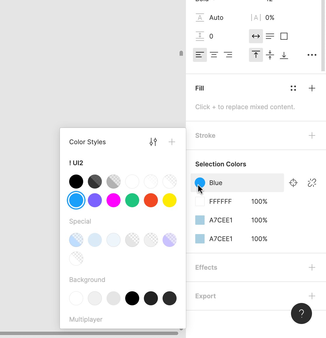
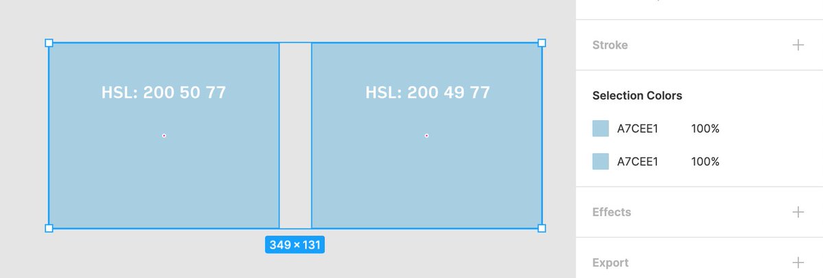
3. We still have this weird problem illustrated in the screenshots. It turns out, our colour precision is higher than a hex string can afford – these two colours are slightly different, so in a way SC isn’t doing anything wrong… but this can be confusing.
But that’s part of the deal, I guess. No, you don’t have to get everything right, but you have to know exactly what you chose not to get right.
Here’s what I *do* like about Selection Colors, though:
1. It’s a flexible little beast. You can use it as color find and replace, you can use it to manage styles, you can use it to clean up your design – or to revel in its messiness (like I often do). It helps dealing with text, where selection can be particularly tricky.
It hopefully sits somewhere perfectly right on the curve of complexity/flexibility. Too little flexibility, and it wouldn’t be powerful. Too much complexity, and it’d be overwhelming.
2. It provides a nice onramp to travel between the worlds of colours and styles. This felt very important to me. Design can be messy and organized, often within the same day. Design systems can be accelerants, but they can also suffocate.
I was hoping for SC to give a set of tools to navigate those two extremes, at least when it comes to colours – and also force us to answer questions that will help in even more projects of this nature.
3. I thought this was a great collaboration between design and engineering; something I also care a lot about, and something I see a lot inside Figma.
We do not only have great engineers, and not only try to cultivate a great respect for either profession (and encourage thoughtful cross-pollination), but we understand that designers alone could not create a useful design tool.
(As an example, with Auto Layout, our engineers – @kenrickrilee and @willyvvu and @jessieteaa – all made design decisions, and some of them I only became aware of after launch. It was great.)
And now, two codas:
One is that I got to use Selection Colors to work for some visuals on my personal book project.
This wasn’t the most important part of this effort, but I’m not going to lie – it’s pretty awesome to use the tools you helped create. It’s like creating on two different levels at the same time.
Two: Just last week, @nlevin reminded me that what I always thought was the beginning of the project, actually wasn’t.
This was the past – what’s the future? I am not sure. Some of you requested Selection Text, and I’m onboard with that, but also I realize it requires quite a bit more thinking.
Over time, my guess would be the crosshairs icons are likely to make an appearance in others parts of Figma UI where that feature would be useful. (Which was yet another part of building SC: sketching the future where SC already exists.)
But nothing is set in stone is yet, and none of these are promises in any way. Let’s just use it for a while and see what we learn. And that includes you. Please send @figmadesign your feedback or use the ? menu to file a support ticket. (We read all of them!)
BTW this wasn’t a complete walkthrough of the process, but parts that stood out to me most.
Any thoughts or questions? Let me know!
In the meantime, I’ll look at some other ideas put aside long time ago, and see if any of them deserve more attention. :·)
(Credit should also go to @eymlin and @skuwamoto who PM’ed this project, the entire design team at
@figmadesign, and many other people helping with bits and pieces!!!)


 Andrei Negrau @andreinegrauHey @figmadesign. Feature request: ability to change multiple fonts at once within a specific selection. Just like I can do now with Selection Colors feature. twitter.com

 Pay what you can